Einstein presented the equations which define the theory of General Relativity in November 1915. The Einstein field equations, as they are known, specify how the geometry of space and time behaves in the presence of matter and energy.
If we know the content of the universe, and if we consider the universe at scales where gravity is dominant, these equations can be used to obtain a description of spacetime over the whole universe. This is one of the most useful features of General Relativity.
Modern cosmology began in Russia in the 1920s with the work of Alexander Friedmann. Using General Relativity, Friedmann showed that a universe which was homogeneous and isotropic should either expand or contract.
At the time, Friedmann’s work was not widely recognised, and he was initially criticised by Einstein himself, who thought he was in error. Einstein developed an alternative model of the universe, which he forced to be static by introducing a term in his equations called the cosmological constant.
We now know that the universe is expanding. How could a great scientist like Einstein make such an error?
We need to go back to the early 20th century. At the time, most observations of the universe were limited to stars in our own Milky Way galaxy, which have low velocities. So the universe appeared to be static.
The scale of the universe was another open question. Astronomers were not even sure that the universe contained other galaxies beside our own. Catalogues of astronomical objects contained objects known as spiral nebulae, but their nature was not yet entirely understood. Were they other galaxies outside our own, or were they gas clouds inside the Milky Way? Did the cosmos consist entirely of the Milky Way? This debate raged throughout the 1920s.
The first challenge to the static universe theory came in 1917, when Vesto Slipher measured the spectra of spiral nebulae. He showed that the light they emitted was shifted towards the red. This meant that they were receding from us.
In 1919, the Hooker Telescope was completed. Located at the Mount Wilson Observatory in California, it had a 100-inch aperture, larger than any telescope at the time. Soon after, an astronomer by the name of Edwin Hubble started working at the observatory. He was to make two revolutionary discoveries which changed the scientific view of the universe.
Using the powerful new telescope, Hubble was able observe the spiral nebulae and measure their distances with unprecedented accuracy. In 1924, he showed that they were too distant to be part of the Milky Way, and thus proved conclusively that the universe extended far beyond our own galaxy.
In 1929, Hubble made another remarkable discovery. He obtained the spectra of many galaxies and calculated the relative velocities of the galaxies from the Doppler shifts of spectral lines. All of the galaxies except for a few of the closest displayed redshifts, and thus are receding from us.
What was more, the relationship between the distance and the velocity was a simple linear one. The picture below shows Hubble’s original graph. The points all lie close to a straight line. In other words, the velocity of a galaxy (v) is proportional to its distance (d):

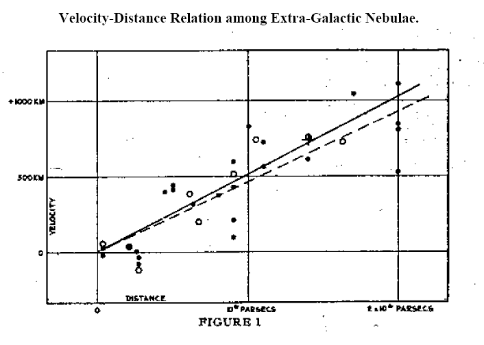
This equation later became known as Hubble’s Law. The constant of proportionality H is known as the Hubble constant.
But these observations did not explain the reason for the recession of the galaxies. Why should galaxies move away from each other? The answer was to come from Einstein’s theory itself.
When we solve Einstein’s field equations, we obtain a mathematical quantity called a metric. The metric may be thought of as a description of spacetime under certain conditions, in the presence of matter and energy.
In 1927, two years before Hubble’s discovery, a Belgian priest and physicist named Georges Lemaître predicted the redshift-distance relation using Einstein’s equations for General Relativity applied to a homogeneous and isotropic universe. The problem was explored further in the 1930s by the mathematicians Howard P. Robertson in the US and Arthur Geoffrey Walker in the UK.
The combined work of these scientists proved that the only metric which can exist in a homogeneous and isotropic universe containing matter and energy – in other words, a universe very much like our own – is the metric for an expanding or contracting universe.
You will notice how the results leading to the exact solutions of Einstein’s equations for such a universe required the combined effort of many scientists. In fact, such solutions are known as the Friedmann-Lemaître-Robertson-Walker metric, or FLRW metric.
We now had an explanation for the observed redshifts of the galaxies. It is caused by the expansion of the universe itself, and the expansion rate is given by the Hubble parameter. The value of this parameter gives us vital information about the evolution of the universe. It is one of the most important quantities in modern cosmology.
In the face of such overwhelming evidence for a dynamical, expanding universe, Einstein dropped his support for the cosmological constant, calling it “the biggest blunder” of his life.
The story does not end here. Astronomers kept observing the universe, measuring the distances and velocities of various objects such as galaxies, galaxy clusters and supernovae, and developing new and improved instruments and methods to measure the Hubble constant. More than seventy years after Edwin Hubble, we made new discoveries which show that Einstein did not make a blunder, and he may have been right about the cosmological constant after all, but for a different reason.