A notebook of useful things

Author: Ivan Debono (Page 1 of 8)

Quick cosmology: The expanding Universe

Einstein presented the equations which define the theory of General Relativity in November 1915. The Einstein field equations, as they are known, specify how the geometry of space and time behaves in the presence of matter and energy.

If we know the content of the universe, and if we consider the universe at scales where gravity is dominant, these equations can be used to obtain a description of spacetime over the whole universe. This is one of the most useful features of General Relativity.

Modern cosmology began in Russia in the 1920s with the work of Alexander Friedmann. Using General Relativity, Friedmann showed that a universe which was homogeneous and isotropic should either expand or contract.

At the time, Friedmann’s work was not widely recognised, and he was initially criticised by Einstein himself, who thought he was in error. Einstein developed an alternative model of the universe, which he forced to be static by introducing a term in his equations called the cosmological constant.

We now know that the universe is expanding. How could a great scientist like Einstein make such an error?

We need to go back to the early 20th century. At the time, most observations of the universe were limited to stars in our own Milky Way galaxy, which have low velocities. So the universe appeared to be static.

The scale of the universe was another open question. Astronomers were not even sure that the universe contained other galaxies beside our own. Catalogues of astronomical objects contained objects known as spiral nebulae, but their nature was not yet entirely understood. Were they other galaxies outside our own, or were they gas clouds inside the Milky Way? Did the cosmos consist entirely of the Milky Way? This debate raged throughout the 1920s.

The first challenge to the static universe theory came in 1917, when Vesto Slipher measured the spectra of spiral nebulae. He showed that the light they emitted was shifted towards the red. This meant that they were receding from us.

In 1919, the Hooker Telescope was completed. Located at the Mount Wilson Observatory in California, it had a 100-inch aperture, larger than any telescope at the time. Soon after, an astronomer by the name of Edwin Hubble started working at the observatory. He was to make two revolutionary discoveries which changed the scientific view of the universe.

Using the powerful new telescope, Hubble was able observe the spiral nebulae and measure their distances with unprecedented accuracy. In 1924, he showed that they were too distant to be part of the Milky Way, and thus proved conclusively that the universe extended far beyond our own galaxy.

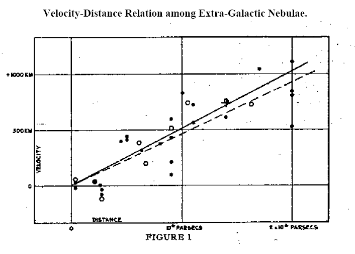
In 1929, Hubble made another remarkable discovery. He obtained the spectra of many galaxies and calculated the relative velocities of the galaxies from the Doppler shifts of spectral lines. All of the galaxies except for a few of the closest displayed redshifts, and thus are receding from us.

What was more, the relationship between the distance and the velocity was a simple linear one. The picture below shows Hubble’s original graph. The points all lie close to a straight line. In other words, the velocity of a galaxy (v) is proportional to its distance (d):
v=Hd

This equation later became known as Hubble’s Law. The constant of proportionality H is known as the Hubble constant.

But these observations did not explain the reason for the recession of the galaxies. Why should galaxies move away from each other? The answer was to come from Einstein’s theory itself.

When we solve Einstein’s field equations, we obtain a mathematical quantity called a metric. The metric may be thought of as a description of spacetime under certain conditions, in the presence of matter and energy.

In 1927, two years before Hubble’s discovery, a Belgian priest and physicist named Georges Lemaître predicted the redshift-distance relation using Einstein’s equations for General Relativity applied to a homogeneous and isotropic universe. The problem was explored further in the 1930s by the mathematicians Howard P. Robertson in the US and Arthur Geoffrey Walker in the UK.

The combined work of these scientists proved that the only metric which can exist in a homogeneous and isotropic universe containing matter and energy – in other words, a universe very much like our own – is the metric for an expanding or contracting universe.

You will notice how the results leading to the exact solutions of Einstein’s equations for such a universe required the combined effort of many scientists. In fact, such solutions are known as the Friedmann-Lemaître-Robertson-Walker metric, or FLRW metric.

We now had an explanation for the observed redshifts of the galaxies. It is caused by the expansion of the universe itself, and the expansion rate is given by the Hubble parameter. The value of this parameter gives us vital information about the evolution of the universe. It is one of the most important quantities in modern cosmology.

In the face of such overwhelming evidence for a dynamical, expanding universe, Einstein dropped his support for the cosmological constant, calling it “the biggest blunder” of his life.

The story does not end here. Astronomers kept observing the universe, measuring the distances and velocities of various objects such as galaxies, galaxy clusters and supernovae, and developing new and improved instruments and methods to measure the Hubble constant. More than seventy years after Edwin Hubble, we made new discoveries which show that Einstein did not make a blunder, and he may have been right about the cosmological constant after all, but for a different reason.

A late 17th century treatise on fencing and horsemanship

Here is a work in progress. It’s a transcription of Alimento di Sangue Illustre, a late 17th century Neapolitan treatise on fencing and horsemanship by Francesco Giovanni Angelo di Nuzzo.

Caspar van Wittel, View of the Royal Palace in Naples, 1706.
Prince Lorenzo Onofrio Colonna, Viceroy of Naples from 1687.
Portrait by Jacob Ferdinand Voet (1639-1689)

MontePython on CC-in2p3

The documentation on the IN2P3 Computing Centre portal does not contain any information specific to MontePython. Boris Bolliet provides some very useful instructions on his website. Aside from this, there is nothing at all. So I thought I would provide a few tips, especially for Euclid consortium members. 

If you are a member, you can request an account on the cluster. 

The first thing to do is to create a folder on /sps/euclid/Users/. You may choose any name (e.g. your username:  /sps/euclid/Users/username).

In order to use MontePython, you will need to install software packages. Just follow the instructions on Boris Bolliet’s page.

The tricky bit is the job submission script. I am grateful for Quentin Le Boulc’h for what follows. We spent a lot of time trying to pin down the right parameters for the resource options.

You have two options.

Option 1

#!/bin/sh
#$ -N yourscript
#$ -P P_euclid
#$ -q pa_long
#$ -l sps=1
#$ -j n
#$ -l os=cl7 -pe openmpi 4
#$ -o $JOB_ID.out
#$ -e $JOB_ID.err

export OMP_NUM_THREADS=1

source /pbs/home/y/yourusename.profile
source /usr/local/shared/bin/openmpi_env.sh

mpirun -np $NSLOTS montepython/montepython/MontePython.py run  etc. 

Option 2:

#!/bin/sh
#$ -N yourscript
#$ -P P_euclid
#$ -q pa_long
#$ -l sps=1
#$ -j n
#$ -l os=cl7 -pe openmpi_8 32
#$ -o $JOB_ID.out
#$ -e $JOB_ID.err

export OMP_NUM_THREADS=8

source /pbs/home/y/yourusename.profile
source /usr/local/shared/bin/openmpi_env.sh

mpirun -np 4 -pernode montepython/montepython/MontePython.py run  etc. 

The APC cluster (1): SSH without a password

Why would you need to avoid entering a password when you use SSH? Typing in your password each time you log in is tedious. You may also need to call ssh from within a shell script.

These instructions are not specific to the APC computing cluster (APCSSH and APCCLM) .  They will work on any Unix-like operating system.

You already have an APC account with a login name, which I shall call APClogin. I assume you have already succesfully logged into your APC account using your password. Write down your password somewhere, case you need it.

If you are using Mac OS X, you can do all of the steps below in Terminal. If you are using Windows, you need an ssh client such as PuTTY .

LocalLogin stands for the login name on your local machine.

Here’s how to do it.

1: Generate the authentication keys

Type the following in your terminal window.

$ ssh-keygen -t rsa

You will get a message saying:

Generating public/private rsa key pair.
Enter file in which to save the key (/Users/LocalLogin/.ssh/id_rsa):

If you wish to change the default location, go ahead and specify a file path. Better to keep it simple, and just press Enter.
You will get this message asking for a password (“passphrase”). Do not enter one. Just press Enter, twice.

Enter passphrase (empty for no passphrase):
Enter same passphrase again:

If you did everything properly you will get a message giving the file path to the keys, and the key fingerprint:

Your identification has been saved in /Users/LocalLogin/.ssh/id_rsa.
Your public key has been saved in /Users/LocalLogin/.ssh/id_rsa.pub.
The key fingerprint is:
SHA256:dWitjNhmrttyt7oCFmYdsu6wdA6Y5yao8UuoZ7Zzgnjsi22Q LocalLogin@apcdhcp24.in2p3.fr
The key's randomart image is:
+---[RSA 2048]----+
| |
| . |
| . . O .|
| . o o O + |
| S o B * =|
| ... . + o = = |
| Ho. . o = . .|
|o=+O.o .. o + o |
|o=O+*. ..+ .|
+----[SHA256]-----+

2: Create a .ssh directory on apcssh

Next, you need to create a .ssh directory on apcssh.in2p3.fr by typing:

$ ssh APClogin@apcssh.in2p3.fr mkdir -p .ssh

You will be asked for your password (that is why you need to have it written down somewhere). Type it in.

APClogin@apcssh.in2p3.fr's password:


3. Append your local public key to the authorised keys on apcssh

Enter the line below. You will then be asked for your password, which you need to enter.
$ cat .ssh/id_rsa.pub | ssh APClogin@apcssh.in2p3.fr 'cat >> .ssh/authorized_keys'
APClogin@apcssh.in2p3.fr's password:

4. Done

Now you should be able to log into apccsh.in2p3.fr using the usual ssh command without entering a password.

Doing the same for the APC cluster

If the above works, you can log into apcclm following the same steps, except that you need to log into apccssh first.

In summary:

1. Log into apccsh (which you can now do without a password)

2. Generate the authentication keys

3. Create a .ssh directory on apcclm by typing

$ ssh APClogin@apcclm mkdir -p .ssh

4. And you’re done

The APC cluster (3): Montepython with Euclid likelihoods

The latest public release of Montepython includes Euclid likelihoods for the redshift survey (euclid_pk) and the cosmic shear survey (euclid_lensing).

The __init__.py  file needs to be edited because of Python syntax issues. If you try to use it as provided, you will get two errors messages.

File "/home/[APClogin]/montepython/montepython/likelihoods/euclid_pk/__init__.py", line 224, in loglkl
k_sigma = np.zeros(2.*self.nbin+1, 'float64')
TypeError: 'float' object cannot be interpreted as an index

The problem here is the decimal point after the 2, which makes it a float, when it is being used to create an index, which must be an integer.

Correction:
k_sigma = np.zeros(2*self.nbin+1, 'float64')

The second error is caused once again by an unnecessary decimal point in the index:
File "/home/[APClogin]/montepython/montepython/likelihoods/euclid_pk/__init__.py", line 330, in integrand
return self.k_fid[:]**2/(2.*pi)**2*((self.tilde_P_th[:,index_z,index_mu] - self.tilde_P_fid[:,index_z,index_mu])**2/((2./self.V_survey[index_z])*(self.tilde_P_th[:,index_z,index_mu] + self.P_shot[index_z])**2 + (self.alpha[:,2.*index_z+1,index_mu]*self.tilde_P_th[:,index_z,index_mu])**2
*self.k_fid[:]**3/2./pi**2
*self.nbin*log(self.kmax/self.kmin)))
IndexError: only integers, slices (`:`), ellipsis (`...`), numpy.newaxis (`None`) and integer or boolean arrays are valid indice

Correction:
return self.k_fid[:]**2/(2.*pi)**2*((self.tilde_P_th[:,index_z,index_mu] - self.tilde_P_fid[:,index_z,index_mu])**2/((2/self.V_survey[index_z])*
(self.tilde_P_th[:,index_z,index_mu] + self.P_shot[index_z])**2 + (self.alpha[:,2*index_z+1,index_mu]*self.tilde_P_th[:,index_z,index_mu])**2
*self.k_fid[:]**3/2./pi**2*
self.nbin*log(self.kmax/self.kmin)))

The APC cluster (2): Using Montepython

The official documentation is here http://monte-python.readthedocs.io/en/latest but it glosses over some important details. You may find more information here: http://www.iac.es/congreso/cosmo2017/media/montepython.pdf

Installing Montepython

Installing Montepython is quite straightforward if you follow the installation guide. Just make sure that that your version of Python is 2.7. There are some syntax changes in Python 3 which prevent the code from installing.

Running Montepython

Running Montepython on your local machine is easy if you follow the official documentation. For the code to be any use, however, you need to output chains with thousands of points. And that means running it on the APC cluster.

Here are some helpful tips.

The graphical backend

Montepython and the CLASS Python wrapper use Matplotlib. You need to log in with  the -Y option for both apcssh and apcclm:
$ ssh -Y APClogin@apcssh.in2p3.fr
followed by
$ ssh -Y apcclm

When you run Montepython on the cluster using a script, you will need to set this environment variable in the script itself (see below).

External programs within CLASS

If you modify CLASS by calling an external program (let’s call it PowerSpectrumExtension.py) to calculate some quantity, remember to make it executable by running
chmod +x PowerSpectrumExtension.py

Job submission

You need to write a script that gets the job done. This is described here https://www.apc.univ-paris7.fr/FACeWiki/pmwiki.php?n=Apc-cluster.Scheduler.

When you run jobs on a cluster, you are sharing resources with the other users. If you ask for resources (memory, number of nodes) that are unavailable, or ask for too much, your job will be sent to the back of the queue, or aborted.

Here’s an example of a message for an aborted run:
There are not enough slots available in the system to satisfy the 4 slots
that were requested by the application:
Montepython.py

Either request fewer slots for your application, or make more slots available
for use.

You also need to set the right environment variables for the required libraries

This is an example of a script which ran succesfully on the APC cluster:

#!/bin/bash
#PBS -N JOBNAME
#PBS -o $PBS_JOBID.out
#PBS -e $PBS_JOBID.err
#PBS -q furious
#PBS -m bea
#PBS -M name.surname@apc.univ-paris7.fr
#PBS -l nodes=1:ppn=32,mem=64GB,walltime=200:00:00
export SCRATCH="/scratch/$USER.$PBS_JOBID"
export PATH=/usr/local/openmpi/bin:$PATH
export OMP_NUM_THREADS=8
export LD_LIBRARY_PATH=/usr/local/openmpi/lib/:/usr/local/openmpi/lib/openmpi/:$LD_LIBRARY_PATH
set -e
cd ~/montepython
/usr/local/openmpi/bin/mpirun -np 4 env MPLBACKEND=Agg montepython/Montepython.py run -p input/lcdm.param -o chains/planck/lcdm -N 20000 --silent

The –silent command suppresses Montepython’s screen output (which you don’t need when you submit a cluster job).

Here are some good resources explaingin qsub settings:

 https://hpcc.usc.edu/support/documentation/running-a-job-on-the-hpcc-cluster-using-pbs

http://www.arc.ox.ac.uk/content/pbs

Analysing the chains

Once the run has terminated, output the plots and information by running:

cd montepython
env MPLBACKEND=Agg montepython/Montepython.py info [path]/[to]/[chains]/*.txt --want-covmat

The option –want-covmat outputs the covariance matrix.

Make sure to include env MPLBACKEND=AGG or you will get the usual matplotlib display problems.

Data science and data politics

Internet lore says that the term “data science” was first used by DJ Patil in 2004. In 2015, Patil went on to work for the Obama administration as the first U.S. Chief Data Scientist, helping to launch various White House programmes, including the Data-Driven Justice Initiative.

Data has enmeshed itself in politics to a degree hitherto unseen. This process did not occur overnight. Data science is, after all, just a fancy name for statistics (a view, alas, which is not shared by many Linkedin users). It can be broadly defined as the collection and analysis of big data for the purpose of policymaking. John Graunt‘s publication of Natural and Political Observations upon the Bills of Mortality in 1663 is sometimes identified as the birth of statistics. Whatever the precise date, it coincides with the development of the nation-state as the dominant polity. Rulers and governments realised that the scale of organisation was getting bigger, and accurate information was vital.

The link between data and politics is right there in Graunt’s title.

21st century politicians, and the commentators who shape public debate, use the label “data-driven” far too freely. In the UK, the government talks of “evidence-based policies”. We’re bombarded with figures, percentages, graphs and charts, all checked and verified (remember those Brexit debates?). The trouble is that political debate often revolves around too much data, while the right questions never get asked.

Speed limits and Bayesian evidence

Recently, the French government decided to lower the speed limit on highways to 80 km/h. The stated aim is to reduce traffic fatalities. Really? Let us look at some data. More than 23% of traffic deaths in France are linked to cannabis. In the United States, road crash deaths rise dramatically after “Weed Day”. So why not crack down on drugs instead? Surely that is the most significant feature in the data matrix?

If the government really wished to make evidence-based policies”, the rigorous way to go about it would be something like:

Hypothesis 0: Given the current data on road deaths, alcohol, drugs etc, lowering the speed limit will not reduce fatalities.

Hypothesis 1: Given the same current data, lowering the speed limit will reduce fatalities.

The question is to find the Bayesian evidence for one hypothesis against the other. We don’t have current data for an 80 km/h speed limit, because it hasn’t yet been introduced. In order to answer the question, we would need to simulate future data.

There is plenty of debate going on about this new law. If data scientists were involved, we would be asking how policymakersconcluded that lowering the speed limit was the most effective measure.

GDP and data visualisation

It’s the economy, stupid. The GDP is the buzzword in political discourse. I won’t go into the question of how the GDP is calculated. Some governments cheat, and those that don’t have a hard enough time pinning down the data. EU statistical guidelines say illegal transactions should be included in GDP calculations. The UK did so in 2014 (adding prostitution and drugs), and its economy overtook France. Voilà.

The trouble with so much of the debate on GDP, income or wealth is one of data visualisation. Governments obviously have all the data down to the individual (that’s what tax returns are for), but they often just quote the average. Headlines like “The GDP per capita has risen” tell us very little. It’s just the average (the mean? the median?). It’s even worse when it is followed by “so we’re all better off”. Not necessarily.

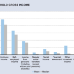
Look at the chart below.


It’s taken from a government report on household income at the national level. It gives a lot of information, but most of it is irrelevant. The one bit of information that matters (the total household income) is given as a mean and median average. We can’t tell how income is distributed, which is what we’re really after if we wish to get a snapshot of the country’s economy. And yet the data must be available for the average to have been calculated.

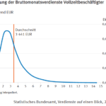
Now look at the second chart.

It’s taken from a German federal government national statistics office publication. It gives the statistical distribution of the income. So we can tell at a glance what the bulk of the population earn. And if you’re a politician, keeping most of the people happy is what you’re after.

The income distribution is also essential in formulating labour laws, which determine things like the minimum wage, and the kinds of jobs created, all of which determine wealth creation. These are policies that require extensive national debate. If the press and the people don’t see the relevant charts, and have to make do with an average, that debate is going nowhere.

Strong claims require strong evidence

Most of all, they require the right questions.

Most Western governments – certainly those in the EU, and the EU Commission itself – are pretty upbeat about globalisation. They will say that it has led to global economic growth. This is correct. So why isn’t everybody happy?

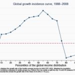
Look at this graph, taken from a World Bank publication. 


The global economy has grown by an average of around 25% in the 20 years from 1988 to 2008.

Now let’s ask the hard questions. Look at the horizontal axis. The developing world has been helped by globalisation (on this specific point, Bill Gates is right). The richest people have done well too. The top 1% of the world’s income earners saw their income rise by 60% over this period.

But an important group of people are missing out on all these benefits. Their incomes have stagnated. They’re the ones in between the rich and poor– roughly the 70th to 90th percentile. They also happen to make up the bulk of the people in the developed world. Places like the European Union.

When European governments point to the benefits of globalisation, it’s not so much that they’re using the wrong data. It’s that they’ve drawn their conclusions before they’ve even looked at it.

Enter the data scientists

We cannot expect all politicians and governments to be data wizards. It’s hard enough finding honest ones these days.

But data scientists can and should help. They should get involved in political debate. The operative keyword in “data scientist” is “scientist”. Data scientists should be sceptics. Like journalists, they should believe nothing and question everything. That is to say, they should verify the data, and ask the right questions.

Some data scientists do get involved in political debate. You can find them all over the Internet. And many get involved in community projects run by voluntary organisation. This is all to their credit. But quite a few tend to be evangelists for blind optimism. They sound more like tech lobbyists than data scientists. When the project is run by someone else (such as the government), and when the data shows unpleasant things, they are nowhere to be found.

Politics used to be about principles, about arguing your point, and perhaps backing it up with facts. In the age of 24-hour news overload, fickle electorates and opinion polls, principles have all but disappeared, replaced by “data-driven policies” and quick-fire assertions about numbers and data, sometimes designed to baffle the electorate (when they don’t baffle the politicians themselves).

DJ Patil stated several times that the mission of the U.S. Chief Data Scientist is to responsibly unleash the power of data. To which it might be replied that it is the people’s responsibility to hold their government to account when it starts going on about data.

Now, more than ever, we need data scientists. But we need them there in the (often) irrational world of politics, mucking in.

The Champernowne and Copeland-Erdős constants in Python

Python is a great tool. One of the best things about it, as anyone who’s used it will tell you, is the vast collection of useful libraries.

The mathematics libraries include a bewildering array of functions, but they were missing two important ones: the Champernowne constant, and the  Copeland-Erdős constant. So I did my bit for the community and wrote two modules to output these numbers to any desired digit.

David Gawen Champernowne (1912-2000)

Paul Erdős (1913-1996)

Arthur Herbert Copeland (1898-1970)

The modules are included in a package called idmaths, which is available on Github.

Here’s some sample code.


Loading

Sorry, something went wrong. Reload?
Sorry, we cannot display this file.
Sorry, this file is invalid so it cannot be displayed.

The first graph

Data visualisation is, we are told, the hottest keyword in data science. Like many items of jargon fashionable in these modern times (just like the phrase ‘data science’ itself), its meaning is at best vague. The tech industry like to think of data visualisation as somehow computer-related, or the final stage of a process of computation and data manipulation which involves coding or the use of software tools. But human beings have been manipulating data and doing data science for millennia, so it follows that the history of data visualisation goes back a long way, long before computers were invented.

Consider graphs, the most common form of data visualisation. A graph is a visual representation of the relation between two variables (I mean the kind that’s plotted on a flat surface).

Who drew the first graph?

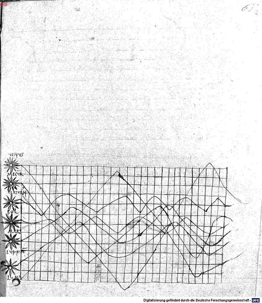
In 1936, Howard Gray Funkhouser described an image in a manuscript discovered by Siegmund Günther in 1877. The manuscript, a copy of Macrobius’s commentary on Cicero’s Somnium Scipionis, is located in the Bayerische Staatsbibliothek in Munich (BSB Clm 14436). It appears to date from the first quarter of the 11th century.

The graph is in the appendix, which bears the title De cursu per zodiacum (‘On the movement through the zodiac’). It was possibly added by an unknown transcriber.  The graph seems to represent a plot of the inclinations of the planetary orbits as a function of the time. The zodiac is shown on a plane, with the horizontal axies showing time (divided into thirty parts), while the vertical axis shows the width of the zodiac.

The world’s first graph?
Folio 61 recto of a copy of Macrobius’s commentary on Cicero’s ‘Somnium Scipionis’. The lines show seven heavenly bodies: Venus, Mercury, Saturn, the Sun, Mars, Jupiter, and the Moon.

Is the the world’s first graph? The use of a grid is uncannily modern. But there are some difficulties.

Each line, belonging to a different planet, is plotted on a different scale, so the periods cannot be reconciled. It would be more accurate to call it a schematic diagram of the data. In other words, the values for the amplitudes which are described in the accompanying text, cannot be read off the graph.

A final note on data visualisation: Funkhouser’s research was motivated by the explosion in the use of graphical methods in the 1930s. That’s eighty years before DJ Patil popularised the term ‘data science’.

Forecasting an election result

In the run-up to the French presidential election in mid-2017, G. Elliott Morris at The Crosstab published some interesting forecasts using simulated Dirichlet draws. The post in question is no longer online. It was previously available on http://www.thecrosstab.com/2017/02/14/france-2017-methodology .

The method itself is fairly well-known (see e.g. Rigdon et al. 2009, A Bayesian Prediction Model for the U.S. Presidential Election ).

I thought it would be interesting to apply the technique when the poll samples and voter base are both tiny. So I did it for Malta, which held a snap election in June 2017. The main problem here is the inconsistency of the polls. For the last few data points, I used a series of voluntary online surveys carried out by a Facebook group calling themselves MaltaSurvey. In hindsight, the survey results appear to have been biased, but at the time there was no way of knowing how to model this bias.

So, without further ado, here is the link to the code on Github.


« Older posts

© 2024 Ivan Debono

Theme by Anders NorénUp ↑