Internet lore says that the term “data science” was first used by DJ Patil in 2004. In 2015, Patil went on to work for the Obama administration as the first U.S. Chief Data Scientist, helping to launch various White House programmes, including the Data-Driven Justice Initiative.
Data has enmeshed itself in politics to a degree hitherto unseen. This process did not occur overnight. Data science is, after all, just a fancy name for statistics (a view, alas, which is not shared by many Linkedin users). It can be broadly defined as the collection and analysis of big data for the purpose of policymaking. John Graunt‘s publication of Natural and Political Observations upon the Bills of Mortality in 1663 is sometimes identified as the birth of statistics. Whatever the precise date, it coincides with the development of the nation-state as the dominant polity. Rulers and governments realised that the scale of organisation was getting bigger, and accurate information was vital.
The link between data and politics is right there in Graunt’s title.
21st century politicians, and the commentators who shape public debate, use the label “data-driven” far too freely. In the UK, the government talks of “evidence-based policies”. We’re bombarded with figures, percentages, graphs and charts, all checked and verified (remember those Brexit debates?). The trouble is that political debate often revolves around too much data, while the right questions never get asked.
Speed limits and Bayesian evidence
Recently, the French government decided to lower the speed limit on highways to 80 km/h. The stated aim is to reduce traffic fatalities. Really? Let us look at some data. More than 23
If the government really wished to make evidence-based policies”, the rigorous way to go about it would be something like:
Hypothesis 0: Given the current data on road deaths, alcohol, drugs etc, lowering the speed limit will not reduce fatalities.
Hypothesis 1: Given the same current data, lowering the speed limit will reduce fatalities.
The question is to find the Bayesian evidence for one hypothesis against the other. We don’t have current data for an 80 km/h speed limit, because it hasn’t yet been introduced. In order to answer the question, we would need to simulate future data.
There is plenty of debate going on about this new law. If data scientists were involved, we would be asking how policymakersconcluded that lowering the speed limit was the most effective measure.
GDP and data visualisation
It’s the economy, stupid. The GDP is the buzzword in political discourse. I won’t go into the question of how the GDP is calculated. Some governments cheat, and those that don’t have a hard enough time pinning down the data. EU statistical guidelines say illegal transactions should be included in GDP calculations. The UK did so in 2014 (adding prostitution and drugs), and its economy overtook France. Voilà.
The trouble with so much of the debate on GDP, income or wealth is one of data visualisation. Governments obviously have all the data down to the individual (that’s what tax returns are for), but they often just quote the average. Headlines like “The GDP per capita has risen” tell us very little. It’s just the average (the mean? the median?). It’s even worse when it is followed by “so we’re all better off”. Not necessarily.
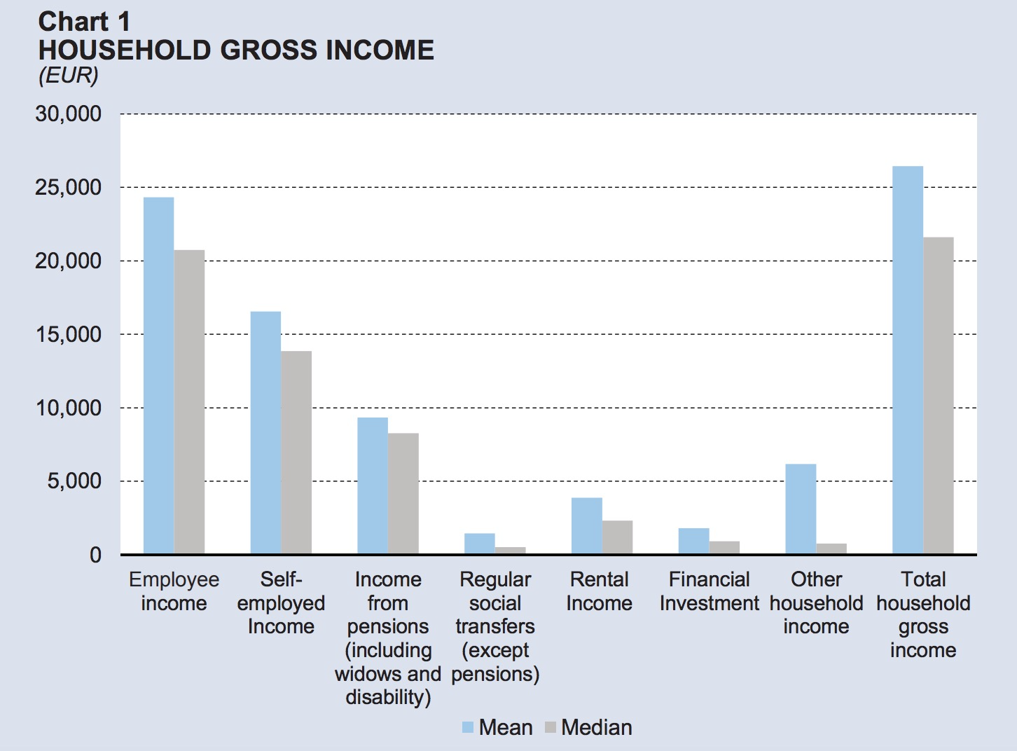
Look at the chart below.
It’s taken from a government report on household income at the national level. It gives a lot of information, but most of it is irrelevant. The one bit of information that matters (the total household income) is given as a mean and median average. We can’t tell how income is distributed, which is what we’re really after if we wish to get a snapshot of the country’s economy. And yet the data must be available for the average to have been calculated.
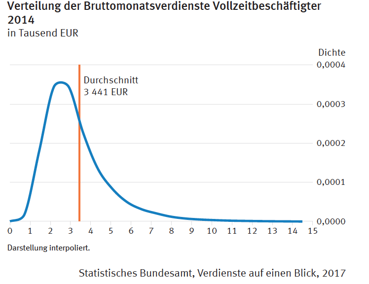
Now look at the second chart.
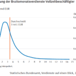
It’s taken from a German federal government national statistics office publication. It gives the statistical distribution of the income. So we can tell at a glance what the bulk of the population earn. And if you’re a politician, keeping most of the people happy is what you’re after.
The income distribution is also essential in formulating labour laws, which determine things like the minimum wage, and the kinds of jobs created, all of which determine wealth creation. These are policies that require extensive national debate. If the press and the people don’t see the relevant charts, and have to make do with an average, that debate is going nowhere.
Strong claims require strong evidence
Most of all, they require the right questions.
Most Western governments – certainly those in the EU, and the EU Commission itself – are pretty upbeat about globalisation. They will say that it has led to global economic growth. This is correct. So why isn’t everybody happy?
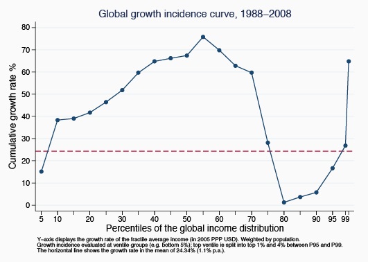
Look at this graph, taken from a World Bank publication.
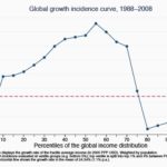
The global economy has grown by an average of around 25
Now let’s ask the hard questions. Look at the horizontal axis. The developing world has been helped by globalisation (on this specific point, Bill Gates is right). The richest people have done well too. The top 1
But an important group of people are missing out on all these benefits. Their incomes have stagnated. They’re the ones in between the rich and poor– roughly the 70th to 90th percentile. They also happen to make up the bulk of the people in the developed world. Places like the European Union.
When European governments point to the benefits of globalisation, it’s not so much that they’re using the wrong data. It’s that they’ve drawn their conclusions before they’ve even looked at it.
Enter the data scientists
We cannot expect all politicians and governments to be data wizards. It’s hard enough finding honest ones these days.
But data scientists can and should help. They should get involved in political debate. The operative keyword in “data scientist” is “scientist”. Data scientists should be sceptics. Like journalists, they should believe nothing and question everything. That is to say, they should verify the data, and ask the right questions.
Some data scientists do get involved in political debate. You can find them all over the Internet. And many get involved in community projects run by voluntary organisation. This is all to their credit. But quite a few tend to be evangelists for blind optimism. They sound more like tech lobbyists than data scientists. When the project is run by someone else (such as the government), and when the data shows unpleasant things, they are nowhere to be found.
Politics used to be about principles, about arguing your point, and perhaps backing it up with facts. In the age of 24-hour news overload, fickle electorates and opinion polls, principles have all but disappeared, replaced by “data-driven policies” and quick-fire assertions about numbers and data, sometimes designed to baffle the electorate (when they don’t baffle the politicians themselves).
DJ Patil stated several times that the mission of the U.S. Chief Data Scientist is to responsibly unleash the power of data. To which it might be replied that it is the people’s responsibility to hold their government to account when it starts going on about data.
Now, more than ever, we need data scientists. But we need them there in the (often) irrational world of politics, mucking in.