A notebook of useful things

Category: Uncategorized (Page 2 of 5)

The first graph

Data visualisation is, we are told, the hottest keyword in data science. Like many items of jargon fashionable in these modern times (just like the phrase ‘data science’ itself), its meaning is at best vague. The tech industry like to think of data visualisation as somehow computer-related, or the final stage of a process of computation and data manipulation which involves coding or the use of software tools. But human beings have been manipulating data and doing data science for millennia, so it follows that the history of data visualisation goes back a long way, long before computers were invented.

Consider graphs, the most common form of data visualisation. A graph is a visual representation of the relation between two variables (I mean the kind that’s plotted on a flat surface).

Who drew the first graph?

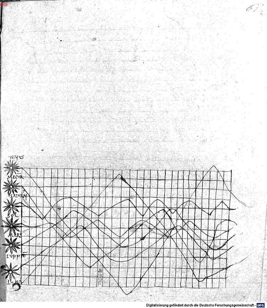
In 1936, Howard Gray Funkhouser described an image in a manuscript discovered by Siegmund Günther in 1877. The manuscript, a copy of Macrobius’s commentary on Cicero’s Somnium Scipionis, is located in the Bayerische Staatsbibliothek in Munich (BSB Clm 14436). It appears to date from the first quarter of the 11th century.

The graph is in the appendix, which bears the title De cursu per zodiacum (‘On the movement through the zodiac’). It was possibly added by an unknown transcriber.  The graph seems to represent a plot of the inclinations of the planetary orbits as a function of the time. The zodiac is shown on a plane, with the horizontal axies showing time (divided into thirty parts), while the vertical axis shows the width of the zodiac.

The world’s first graph?
Folio 61 recto of a copy of Macrobius’s commentary on Cicero’s ‘Somnium Scipionis’. The lines show seven heavenly bodies: Venus, Mercury, Saturn, the Sun, Mars, Jupiter, and the Moon.

Is the the world’s first graph? The use of a grid is uncannily modern. But there are some difficulties.

Each line, belonging to a different planet, is plotted on a different scale, so the periods cannot be reconciled. It would be more accurate to call it a schematic diagram of the data. In other words, the values for the amplitudes which are described in the accompanying text, cannot be read off the graph.

A final note on data visualisation: Funkhouser’s research was motivated by the explosion in the use of graphical methods in the 1930s. That’s eighty years before DJ Patil popularised the term ‘data science’.

Forecasting an election result

In the run-up to the French presidential election in mid-2017, G. Elliott Morris at The Crosstab published some interesting forecasts using simulated Dirichlet draws. The post in question is no longer online. It was previously available on http://www.thecrosstab.com/2017/02/14/france-2017-methodology .

The method itself is fairly well-known (see e.g. Rigdon et al. 2009, A Bayesian Prediction Model for the U.S. Presidential Election ).

I thought it would be interesting to apply the technique when the poll samples and voter base are both tiny. So I did it for Malta, which held a snap election in June 2017. The main problem here is the inconsistency of the polls. For the last few data points, I used a series of voluntary online surveys carried out by a Facebook group calling themselves MaltaSurvey. In hindsight, the survey results appear to have been biased, but at the time there was no way of knowing how to model this bias.

So, without further ado, here is the link to the code on Github.


Musica universalis (14) – The inner space

Airwave (2000), Innerspace

https://www.youtube.com/watch?v=FTFezae00-Q


Bibliography

Eugenio Calabi (1954), The space of Kähler metrics 

Shing-Tung Yau (1978), On the Ricci curvature of a compact kähler manifold and the complex Monge-Ampère equation

The scourge of graduate unemployment

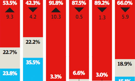
Berlin's trendence institute surveyed over 300,000 European graduates on their perceived career prospects Illustration: Christine Oliver for the Guardian

Berlin’s trendence institute surveyed over 300,000 European graduates on their perceived career prospects Illustration: Christine Oliver for the Guardian


Or what to do with millions of extra graduates.

Europe isn’t alone in facing the problem of graduate unemployment. The BRIC countries are feeling it too.

The numbers are staggering. In India one in three graduates up to the age of 29 is unemployed, according to a Labour Ministry report released last November. Total unemployment in the country is officially closer to 12%.

In China this month a record 7.26 million will graduate from the country’s universities – more than seven times the number 15 years ago.

Unemployment among new Chines graduates six months after leaving university is officially around 15%.

The real unemployment rate could be closer to 30% – some 2.3 million unemployed from this year’s graduating cohort alone, according to Joseph Cheng, professor of political science at City University of Hong Kong.

Meanwhile, back home in Europe, graduates expect to submit an average of 60 applications before landing their first job.  The average wait between graduation and employment is approaching six months. That’s the average.


Musica universalis (2) – Neutrinos

Matt Davey (2013), Neutrino


Bibliography

Introduction to neutrino physics, and references therein.

Genius isn’t always rewarded

Ten cautionary tales from BBC Wired

10 inventors who didn’t get mega-rich from their inventions

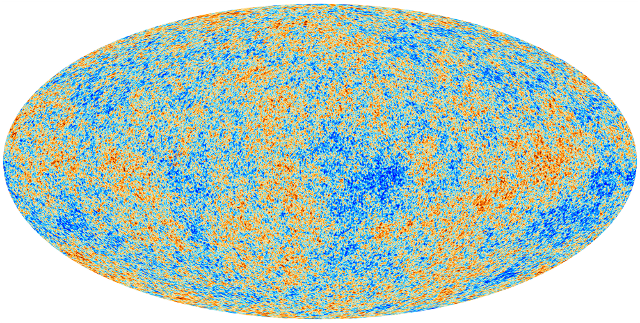
First cosmological results from Planck

I don’t usually post stuff that’s already all over the news media, but the publication of the first results from Planck requires some clarification.

Big, expensive observation missions are put in place with one final aim: to test our model of the Universe. That’s what science is all about.

The results from Planck confirm Lambda CDM (the Condordance Model). Excellent. This increases our confidence in our model. Karl Popper’s “falsifiability” process is a trifle more difficult than good old confidence (used with huge success, and no hang-ups at all, by stock market modellers, but  I digress).

Upshot: we can trust our model.

There is another question though. Can we rule out other models? Now this is what keeps scientists in employment. If our current model were the final word, it would be the end of science (predicted countless times).

The short answer is no. Planck does not rule out models with an evolving dark energy equation of state. Huge sigh of relief all round. We’re not on the dole yet.

It also shows (sorry – “does not rule out the absence of”) stuff that shouldn’t be there with the current model of inflation. So some tweaking required there. The good news in that particular market is that inflation is so poorly understood anyway. So tweaking it won’t cause cataclysmic paradigm shifts.

Bottom line: a splendid job, with excellent results, and a good return on investment.

Planck will probably not give us any teflon-coated frying pans but at €700 million, it’s an absolute bargain, and well worth it.


The new privateers

It was bound to happen sooner or later. The rising number of pirate attacks on merchant and private vessels in the Indian Ocean has driven the already lucrative private security business seaward. A British company has set up a maritime security company to deter pirate attacks and, it is presumed, to engage in offensive action if extreme circumstances. In other words, a privateering venture.

Continue reading

Will Humans Eventually All Look Like Brazilians?


We will all look like this

Will Humans Eventually All Look Like Brazilians? – Yahoo! News.

« Older posts Newer posts »

© 2025 Ivan Debono

Theme by Anders NorénUp ↑