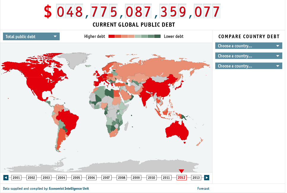
The Economist has just published an interesting – and frightening – interactive map showing public debt across the world. It calls it the Global Debt Clock.
It makes for uncomfortable viewing. Here’s what it looks like on 4 September 2012 at 2143 GMT.

Leave a Reply